Dawanda (acq. Etsy)
Role
Product Designer
Team
iOS + Android devs, QA, Designer, PM
Project duration
2016
Role
Product Designer
Team
iOS + Android devs, QA, Designer, PM
Project duration
2016
My role
I joined the new mobile team, which mission was to build a native iOS and Android App for Dawanda’s marketplace .
I joined the new mobile team, which mission was to build a native iOS and Android App for Dawanda’s marketplace .
Responsibilities
Full design process for iOS and Android devices
Full design process for iOS and Android devices
Software
Principle, Sketch, Zeplin, Jira, Slack
Principle, Sketch, Zeplin, Jira, Slack
What problems did we discover?
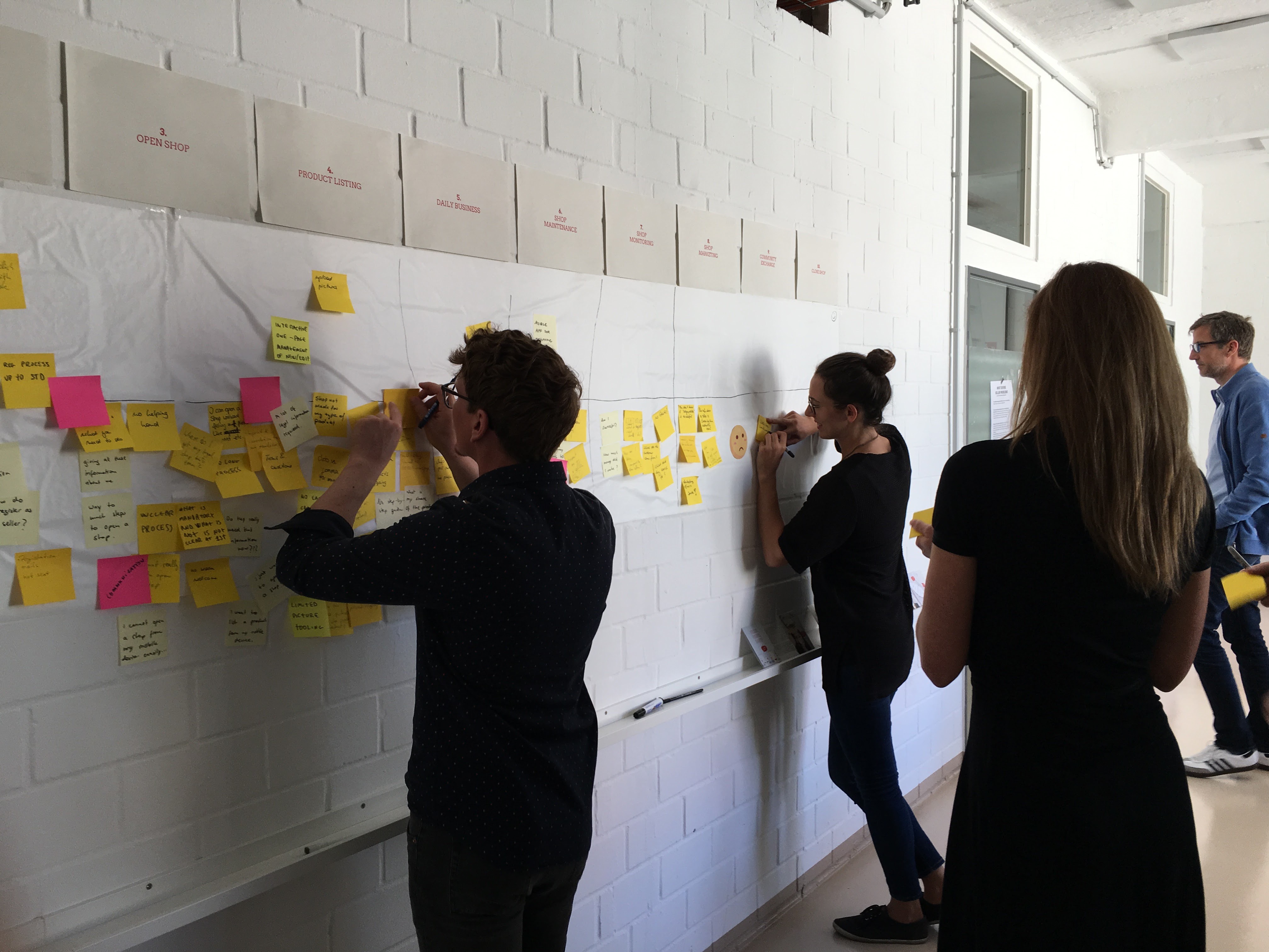
We kicked off our discovery phase by looking at our existing data, conducting user interviews and doing a journey-mapping workshop with the team.
The insights helped us define the problem space: Users were not engaged with the app content because it was very generic, they didn’t find what they were looking for because discovery and search wasn’t intuitiv and misunderstood our USPs.
Dawanda wasn’t just a regular marketplace like Amazon, but instead was hosting creators and entrepreneurs to sell unique, handmade and customisable products.
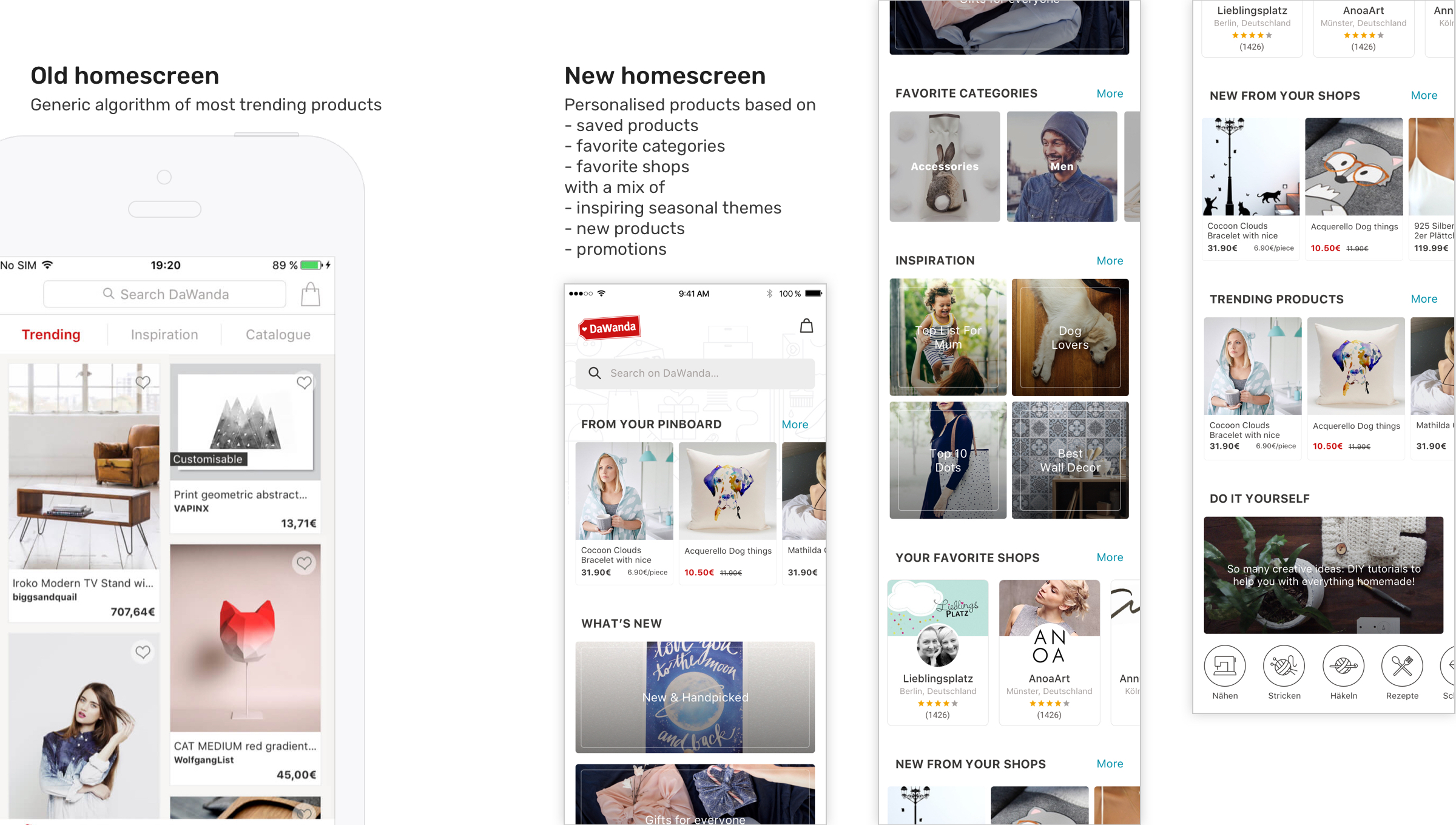
So one of the improvements we rolled out during the last quarter I’ve spent with Dawanda was a new onboarding flow and homescreen experience to tackle the above problems.
Our success metrics were increased engagement (time spent), retention and conversion rates.
Exploration and decision making for our MVP
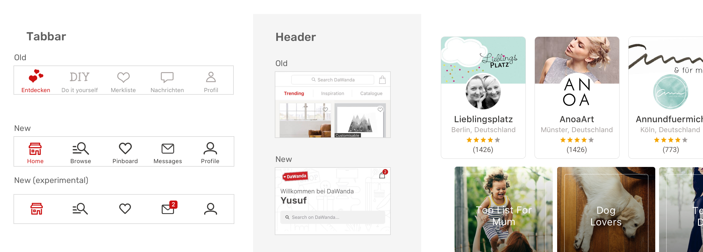
One of the early UX decisions was to replace the “DIY” tab with a permanent “search/browse” tab. We wanted it to be accesible from every place in the app so users could easily jump to a new discovery journey. Our data indicated that engagement with our “DIY” section was lower than expected, despite the great content. We decided to move “DIY” to a section in our new homescreen. While we were restructuring the information architecture, we also redesigned the icons and made them more accessible and clear.

For our new onboarding and homescreen IA we went through a design sprint from low to high fidelity mockups and prototypes in multiple workshops involving the whole cross functional team.
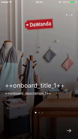
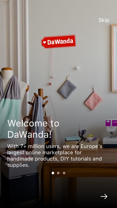
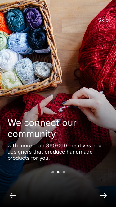
We decided to introduce a new 3-step onboarding flow communicating our value propositions and create a homescreen with different section categories (e.g. “What’s new” | “Inspiration” | “DIY” | “Trending products”) to engage different buyer intentions.

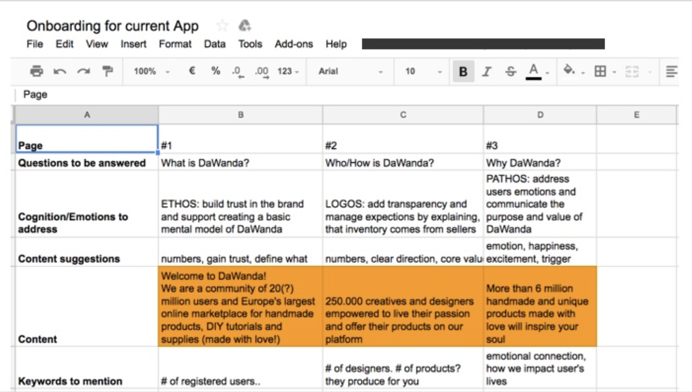
For our Onboarding content we collaborated with our brand and marketing team to formulate our USPs. The sheet below shows our approach to answer specific questions about Dawanda and speak to the emotions of our users.
Finalizing designs & launch
After multiple iterations and testing with our devs we finalized both the new onboarding and homescreen experience.

We introduced clearer tabbar icons, an improved onboarding to communicate our USPs and a personalised, more engaging homescreen experience.
Some interactions
Discovery through different entry points on our new homescreen
Interaction from product list to product detail page + adding to basket

Browsing and adding product to your pinboard
We launched our iteration after 3 months of development and received tons of positive feedback from our customers and our internal stakeholders. 🎉
Outcomes & results and one more thing...
We observed usage data and saw a positive uptrend in our engagement metrics.
On both operating systems (Android/iOS), we compared users who went through onboarding vs. no onboarding.
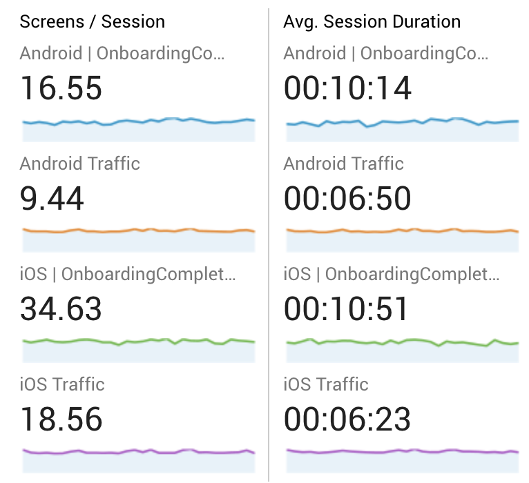
Users who went through onboarding spent more time browsing through the app, discovered more and almost doubled the amount of products they looked into. Our PDP-Checkout conversion rate increase by about 20%!
We measured the number of CS calls with complaints related to our app, which also went down.
But somehow our AppStore ratings were not so great.
We measured the number of CS calls with complaints related to our app, which also went down.
But somehow our AppStore ratings were not so great.
Giving our happy users a voice
Our AppStore rating was at an average of 2.6 stars by the time we released our new app and stayed like this for a couple of weeks.
We knew that App users were happy about the new design of the App because they reached out to us directly on other channels. So why wouldn’t that be reflected in our AppStore rating?
We knew that App users were happy about the new design of the App because they reached out to us directly on other channels. So why wouldn’t that be reflected in our AppStore rating?

Luckily Apple released their new in-app review prompt feature by the time we launched our App update and I suggested to the team to implement it asap.
We set our success metric to move from 2.6 stars to 3.5 stars in a two months frame. (Trello ticket)
The prompt would appear after the first purchase or after the third product has been favourited.
We set our success metric to move from 2.6 stars to 3.5 stars in a two months frame. (Trello ticket)
The prompt would appear after the first purchase or after the third product has been favourited.

In-app review prompt example
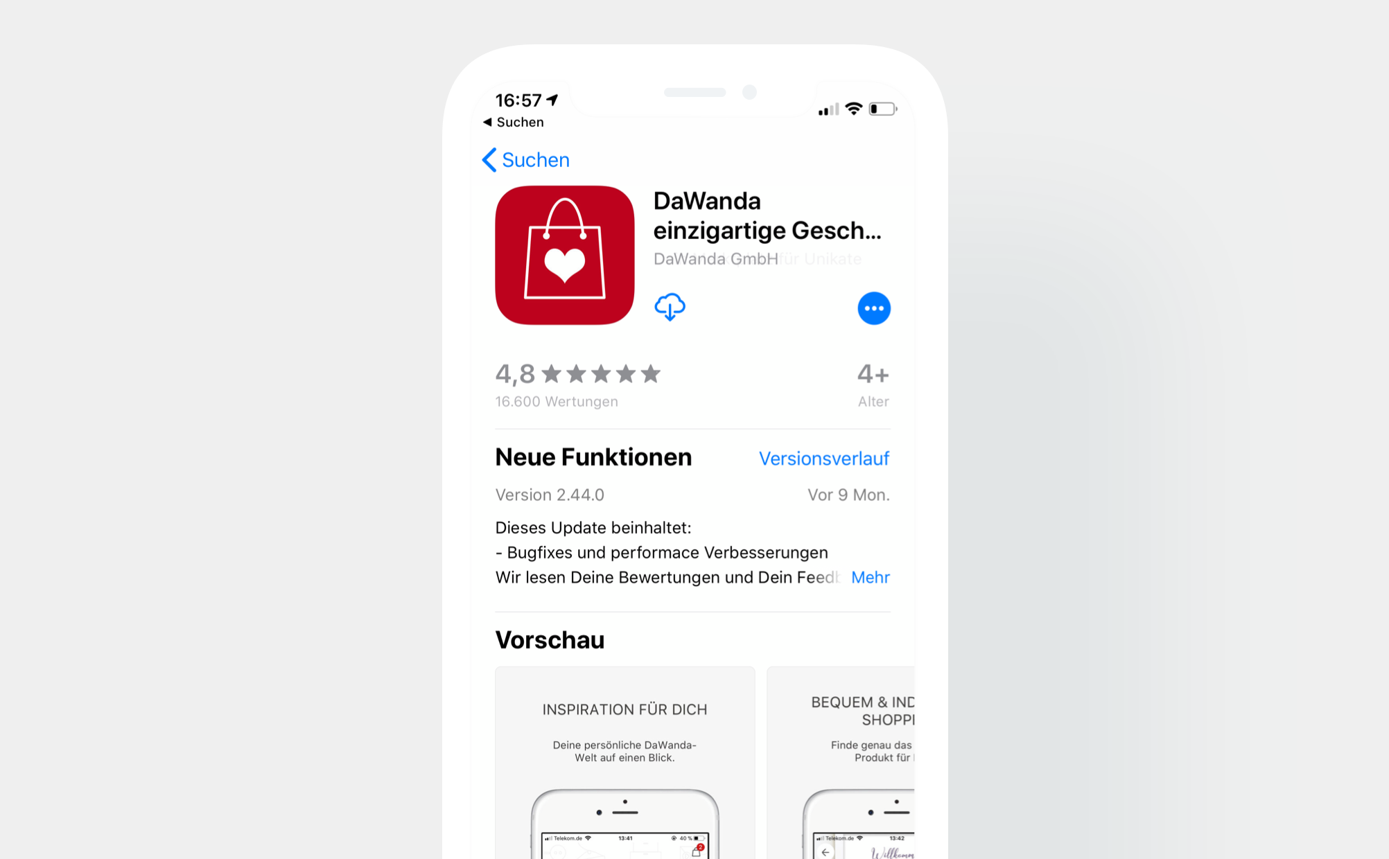
We achieved more than we expected: In just one month our AppStore rating increased to 4.8 stars with over 16k ratings. Users shared (mostly in German) how happy they were about the new app and the design. Our CEO gave kudos to the whole team on Slack and everyone was happy. I added and translated some examples below :)
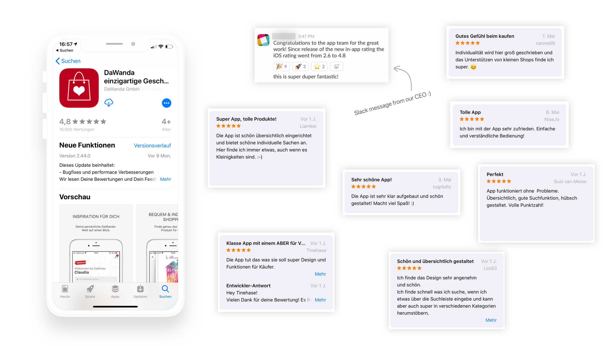
“Designed nice and clear. I find the design very pleasent and nice. I’m quick in finding what I’m looking for using the search bar and also easily discover different categories.”
“Perfect. App works without any issues. Clear, good search, lovely designed. Full score!”
“Great App. The app works as expected with great design and function for buyers”
“Perfect. App works without any issues. Clear, good search, lovely designed. Full score!”
“Great App. The app works as expected with great design and function for buyers”
“Very nice App! The App is clearly structured and nicely designed. Great fun! “
“Great app, nice products! The app is designed very clearly and offers a lot of unique things. I always find something, even small things.”
“Great app, nice products! The app is designed very clearly and offers a lot of unique things. I always find something, even small things.”
You reached the end of this case study. I hope you enjoyed it as much as me writing it. If anything was unclear or you have questions I would appreciate your feedback!
Thank you!