Tapcom
Role
Product Designer
Product Designer
Category
Messaging
Messaging
Platform
iOS, Apple Watch, Web
iOS, Apple Watch, Web
Timeframe
2014
2014
 About
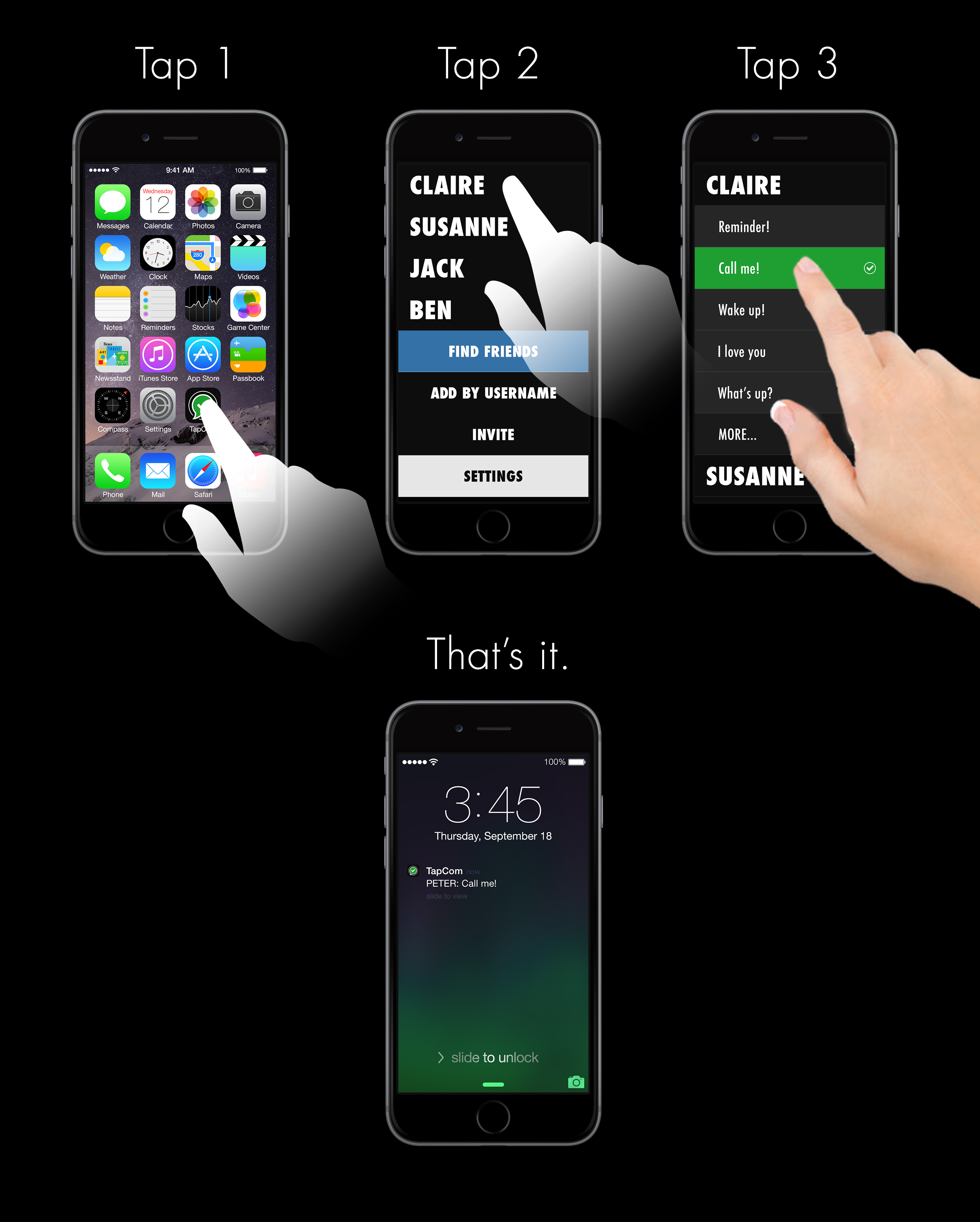
AboutTapcom is a messaging app I brainstormed and developed together with a friend. The problem we wanted to solve is the time it takes to write and send a simple repetitive message. Our goal was to reduce the effort (i.e. # of taps) to send such messages. We released the iOS app around two months later.
My role
I took over the creative part and basically designed the whole experience. From concepting to final designs. I also designed & developed the landing page (not online anymore).
Team
Dev, UX
Focus areas
Tools / Software
Dev, UX
Focus areas
- Wireframing
- Prototyping
- Testing
- High-fidelity designs
- Dev handover
Tools / Software
- Pen & Paper
- Sketch
- Photoshop
- Skype
Concepts
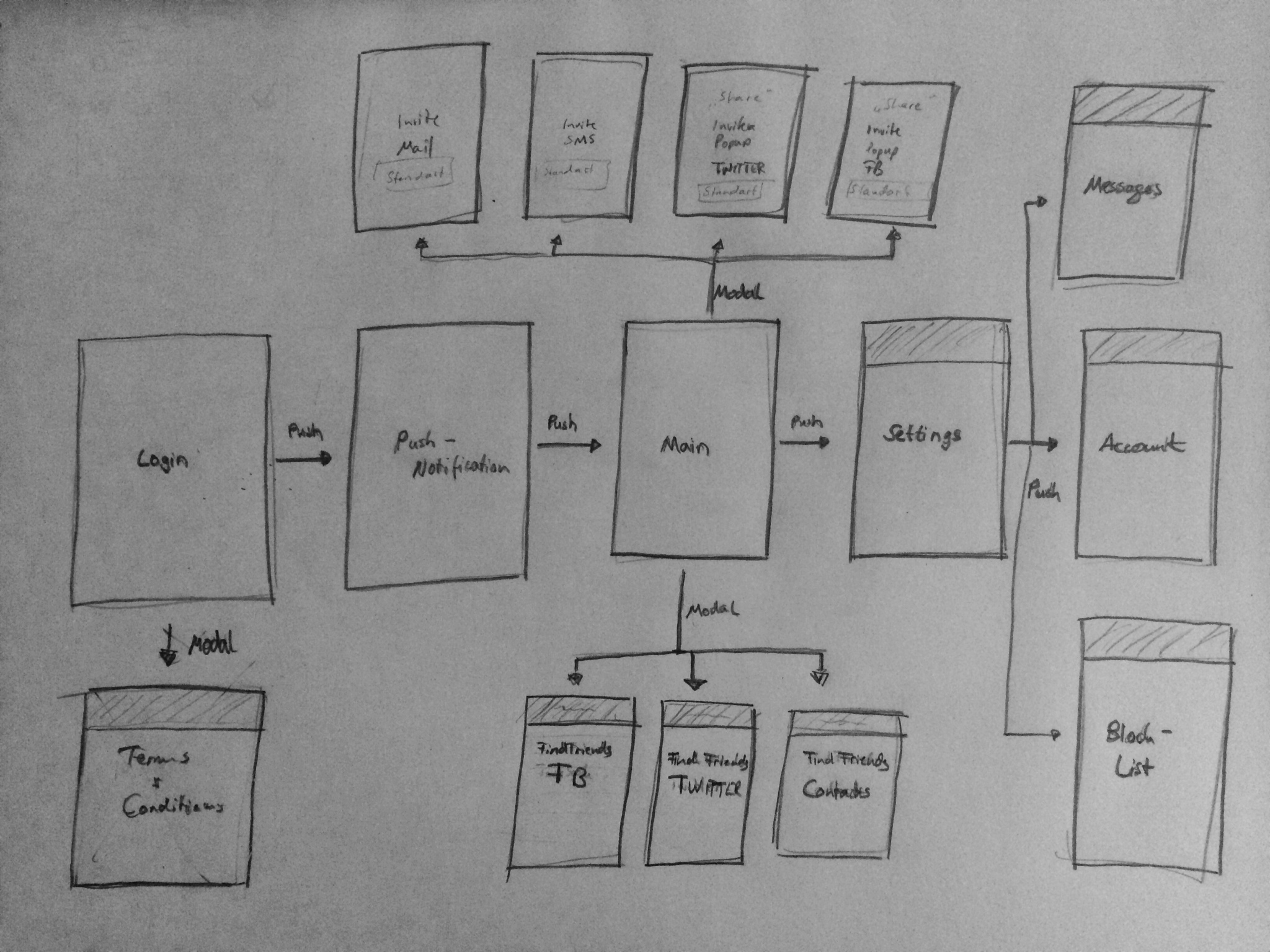
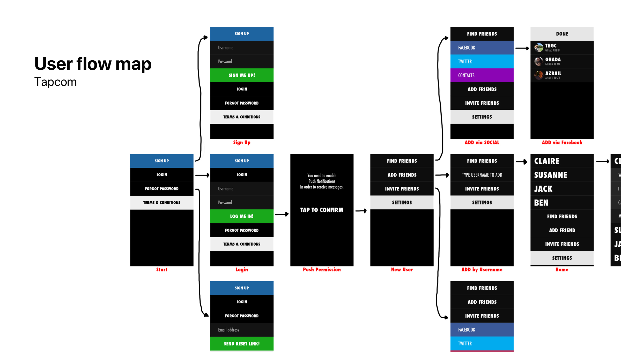
I sketched the simple flow on paper to get an overview of the user journey and screens to work on.
Designs
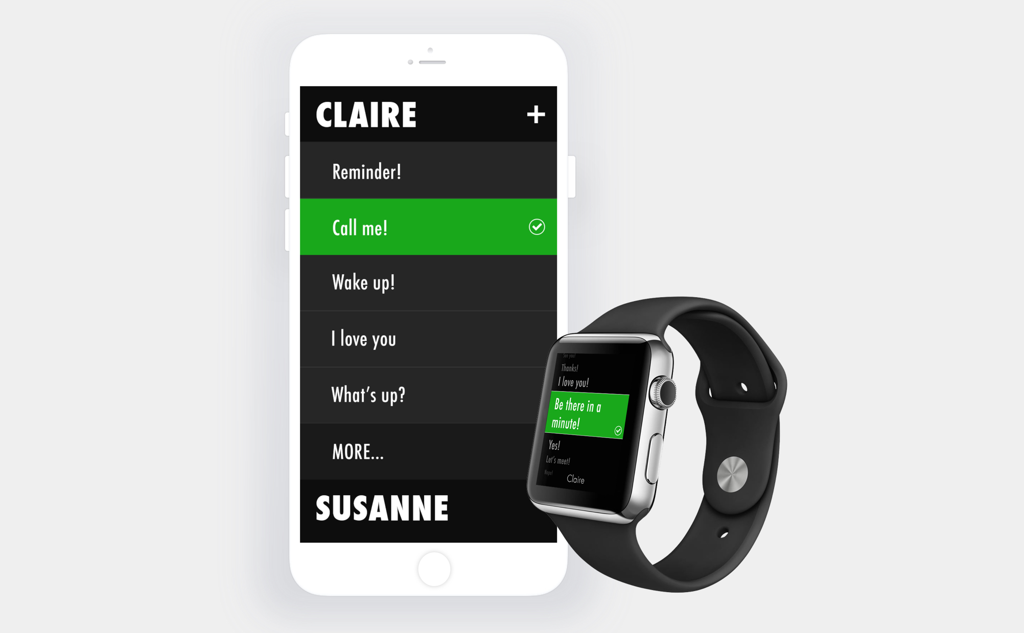
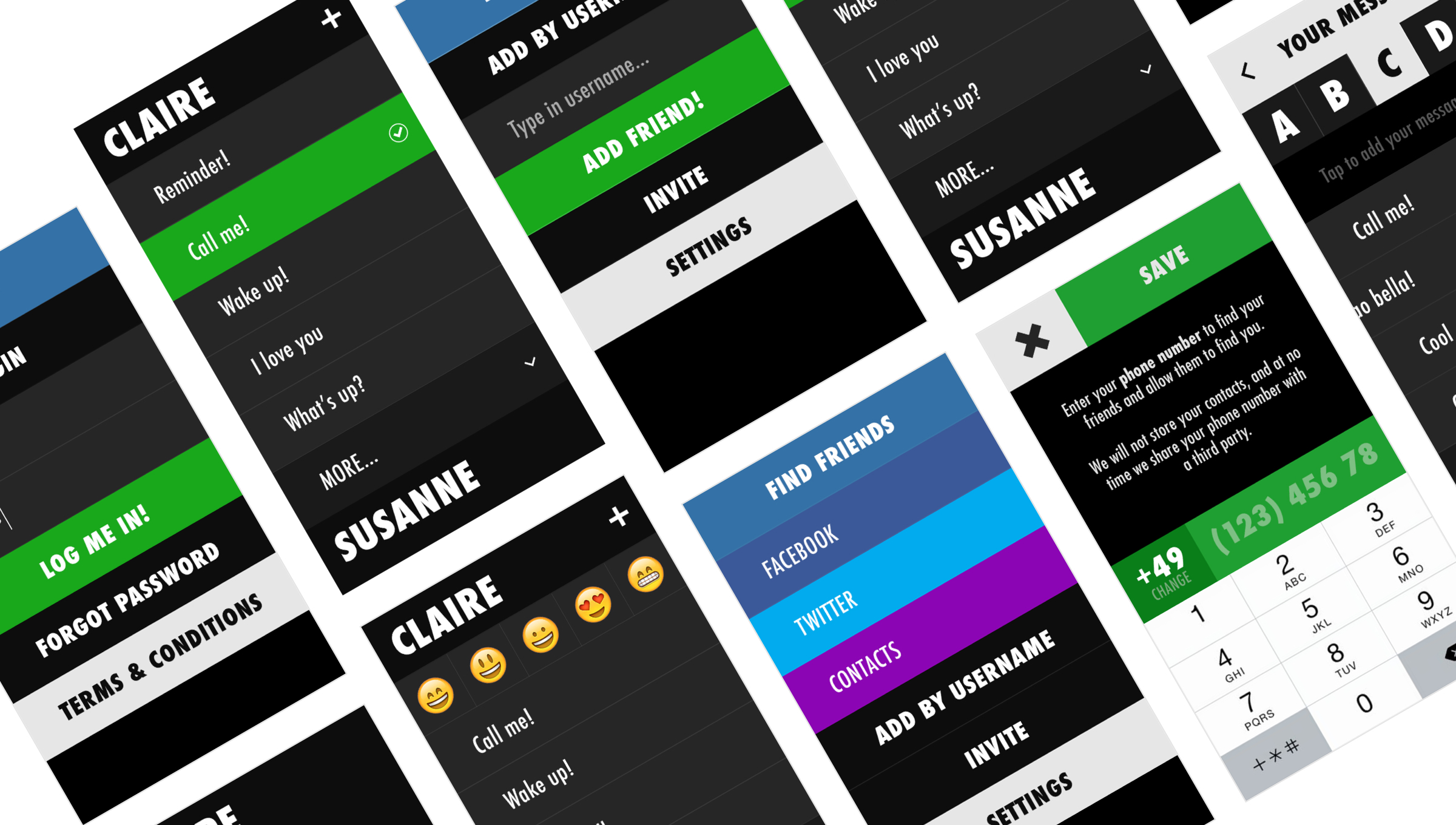
App
My goal for the final designs was to use big and bold visual elements and typography. I wanted the user to never miss the right button or message and speed up the interaction of sending a message in any situation.
Details
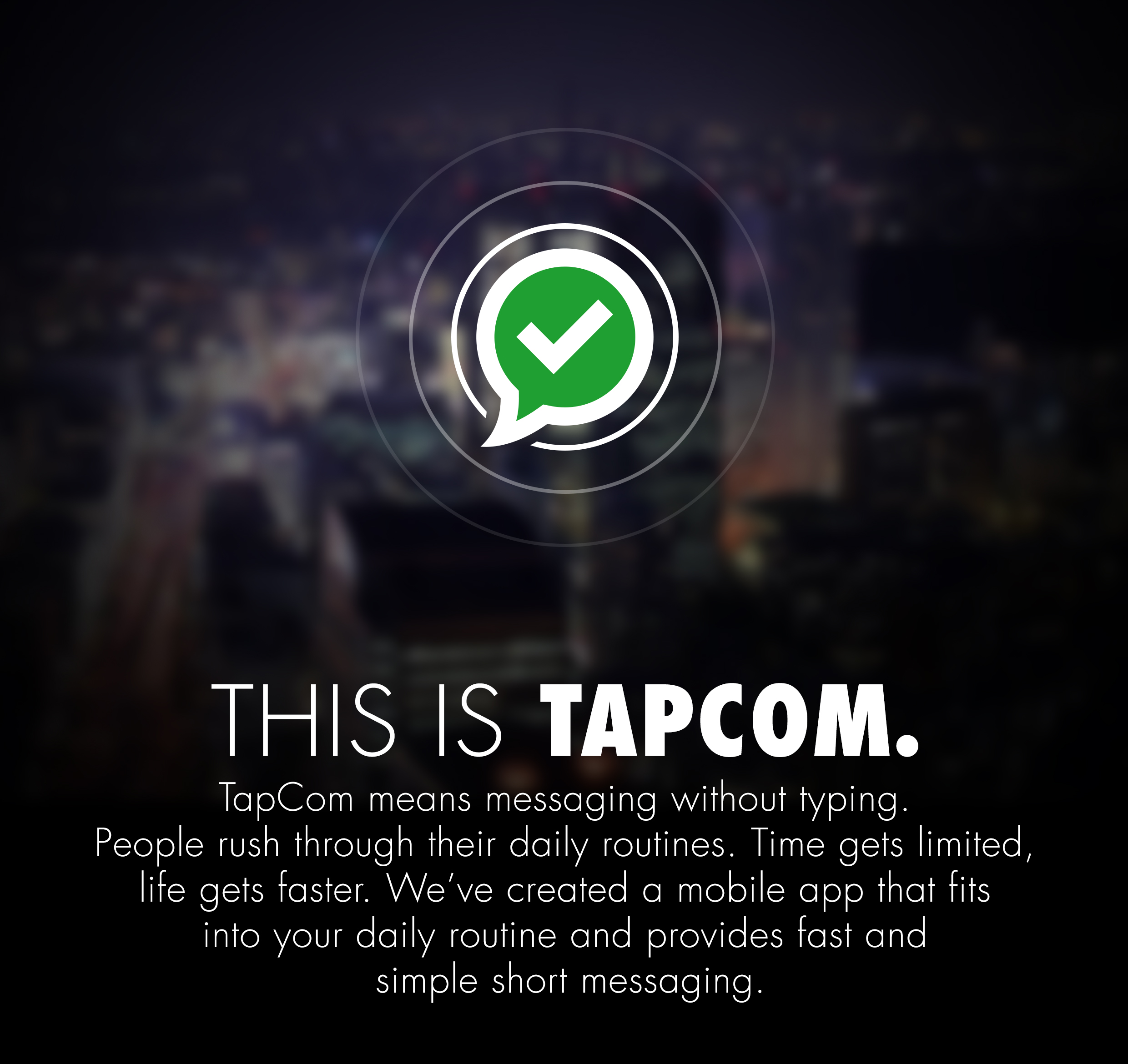
For the Logo and App icon I wanted something that unifies communication and the motion of a tap which is the basic thought of our app. “Tapcom” = tap + communicate.
For the Logo and App icon I wanted something that unifies communication and the motion of a tap which is the basic thought of our app. “Tapcom” = tap + communicate.
Web
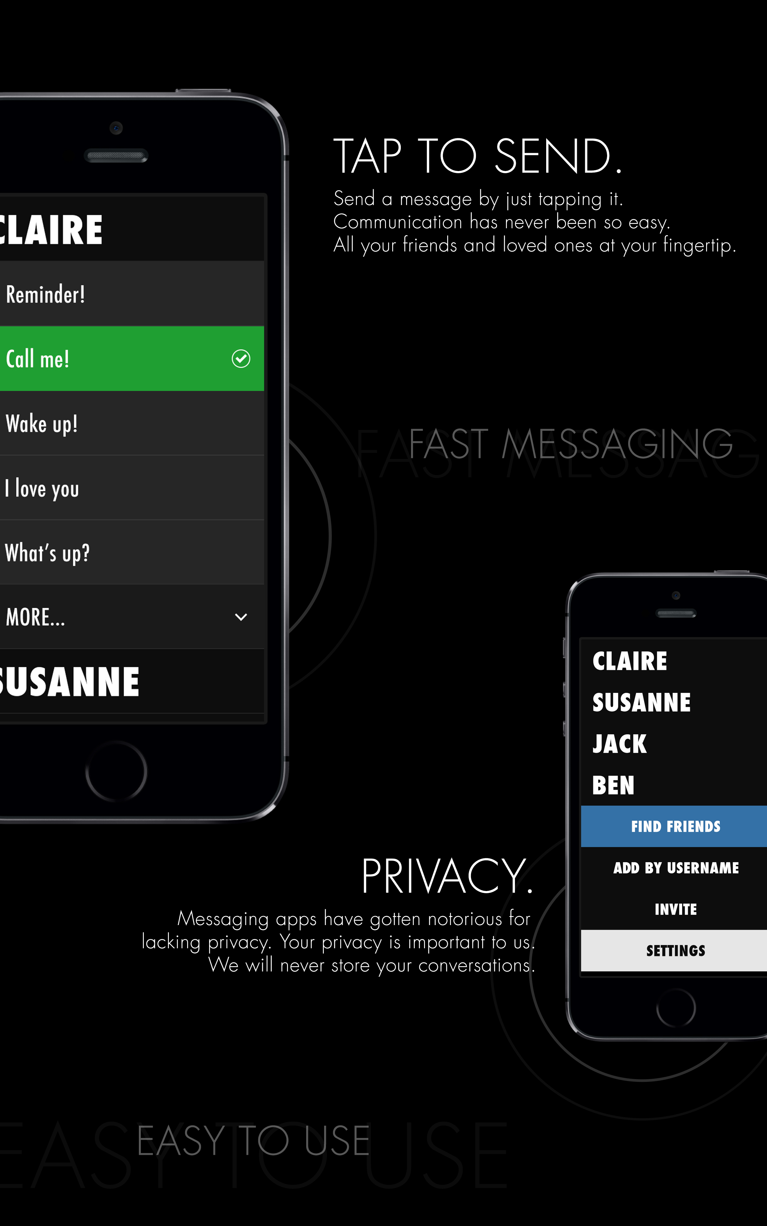
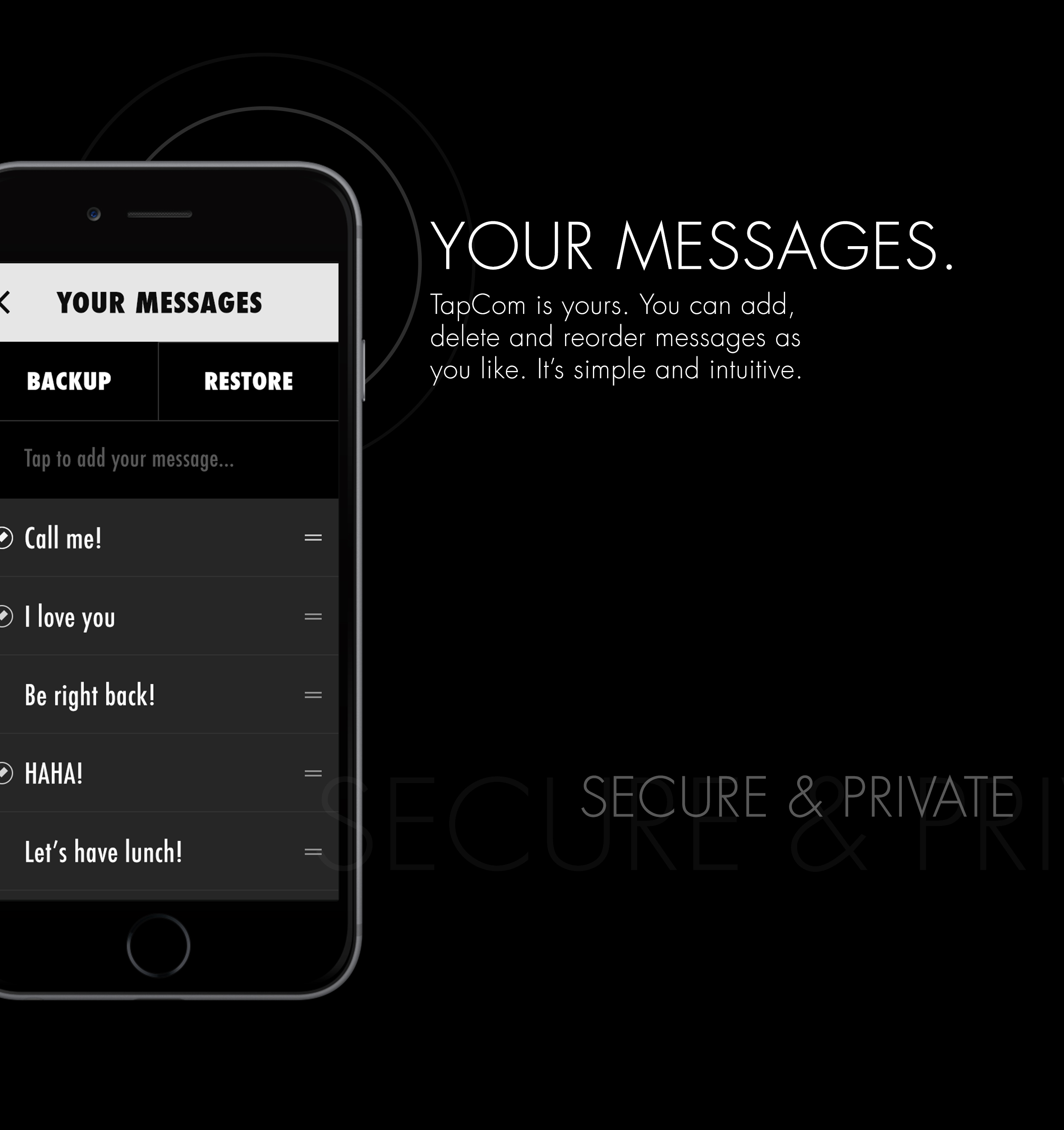
I also created assets for the landing page explaining the purpose and functionality of the app.
I also created assets for the landing page explaining the purpose and functionality of the app.
Header
![]()
How to
![]()

Recap
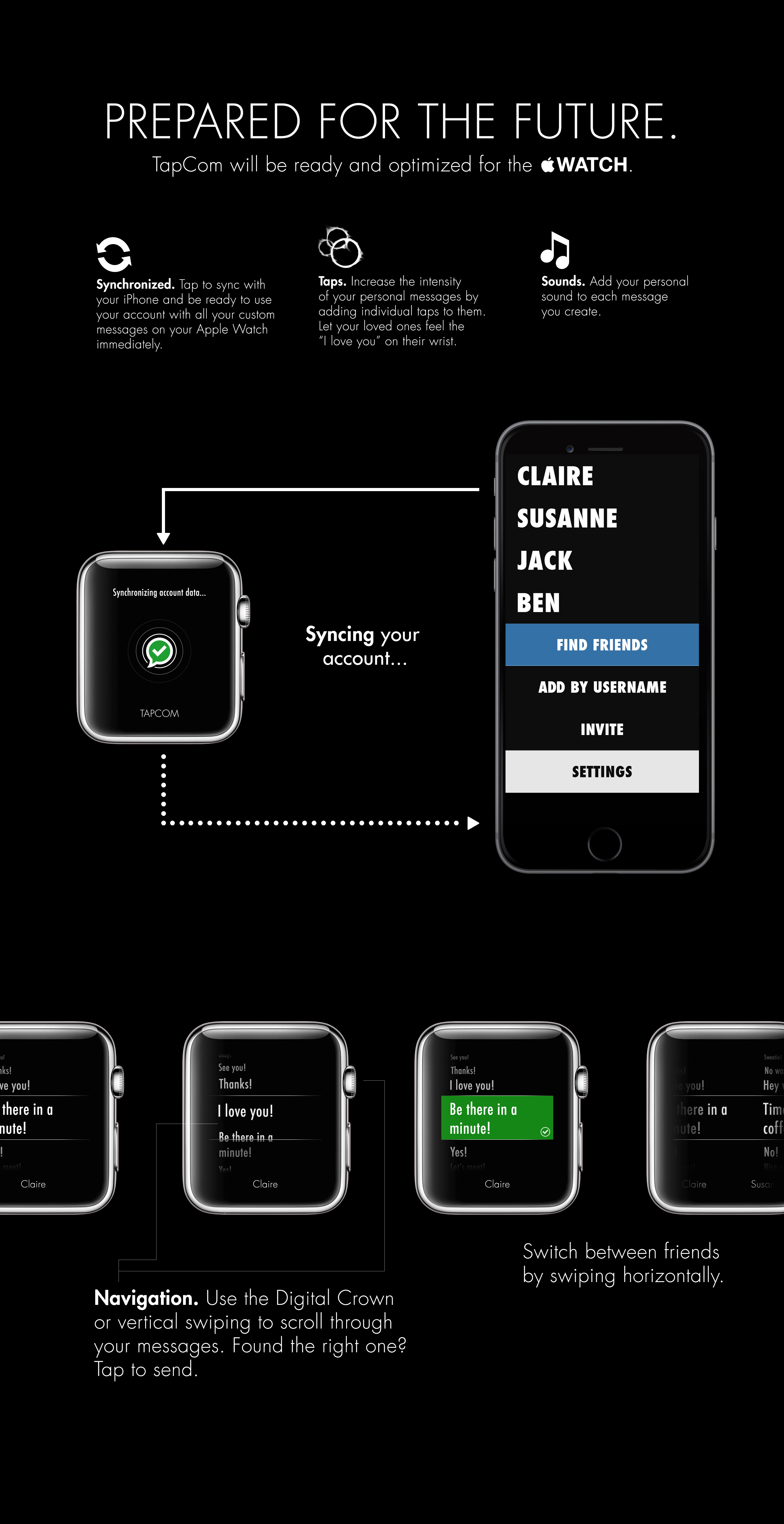
The underlying thought which motivated us to work on this project was later confirmed to be the right direction to go. Apple introduced preset replies which can be send from your wrist directly.
![]()
Although we removed our app from the Appstore it was exciting and fun to work on this. I painfully learned not to fall in love with my ideas before testing the **it out of them. And that releasing an App to the Appstore is like throwing a needle into a haystack. Without a proper marketing plan and a budget, one has to be extremely lucky to hit the right nerve and rely only on word of mouth. 5 years later and I know I would never dive head first into an idea ever again - not before Pretotyping it.
Although we removed our app from the Appstore it was exciting and fun to work on this. I painfully learned not to fall in love with my ideas before testing the **it out of them. And that releasing an App to the Appstore is like throwing a needle into a haystack. Without a proper marketing plan and a budget, one has to be extremely lucky to hit the right nerve and rely only on word of mouth. 5 years later and I know I would never dive head first into an idea ever again - not before Pretotyping it.