Tajawal + Almosafer
Role
Product Designer, Owner
Team
BE+FE DEV, QA (8x)
Project duration
2018
Role
Product Designer, Owner
Team
BE+FE DEV, QA (8x)
Project duration
2018
About
Tajawal [part of Seera Group and now Almosafer] was an Online Travel Agency and one of the fastest growing startups in the MENA region.
The content of this case study covers the work on Tajawal’s Progressive Web App (PWA) but also relates to Almosafer’s PWA. Both brands almost share the same technical architecture and UX but only distinguish by Brand Identity. Therefore the seen content focuses on Tajawal only.
My role
My responsibilities stretched from owning the whole product design (UX/UI) process to PO/PM duties for a team of 5-6 devs & QA. Tajawal’s strategic investment into mobile web was in need of a dedicated team, specifically a dedicated product designer with a mobile first mindset.
My responsibilities stretched from owning the whole product design (UX/UI) process to PO/PM duties for a team of 5-6 devs & QA. Tajawal’s strategic investment into mobile web was in need of a dedicated team, specifically a dedicated product designer with a mobile first mindset.
Responsibilities
Project planning (Roadmap + User stories + Sprints), Stakeholder communication, Full design cycles
Project planning (Roadmap + User stories + Sprints), Stakeholder communication, Full design cycles
Software
Sketch, Adobe XD, Zeplin, Jira, Youtrack, Slack
Sketch, Adobe XD, Zeplin, Jira, Youtrack, Slack
What were the existing problems with Tajawal’s mweb?
Customers
Tajawal’s mobile website was neither optimized for a convenient mobile experience nor did hit performance goals we set for ourselves. Customers were bouncing off due to high loading times and unclear UX. Small fixes were done to increase the performance by reducing the time for the first meaningful paint in a hackathon. This resulted in a 22% decreased bounce rate.
Tajawal’s mobile website was neither optimized for a convenient mobile experience nor did hit performance goals we set for ourselves. Customers were bouncing off due to high loading times and unclear UX. Small fixes were done to increase the performance by reducing the time for the first meaningful paint in a hackathon. This resulted in a 22% decreased bounce rate.
Organization
The team members which focused on the first improvements to the mobile website were not fully dedicated to build a better mobile user experience.
The team members which focused on the first improvements to the mobile website were not fully dedicated to build a better mobile user experience.
How did we plan to solve them?
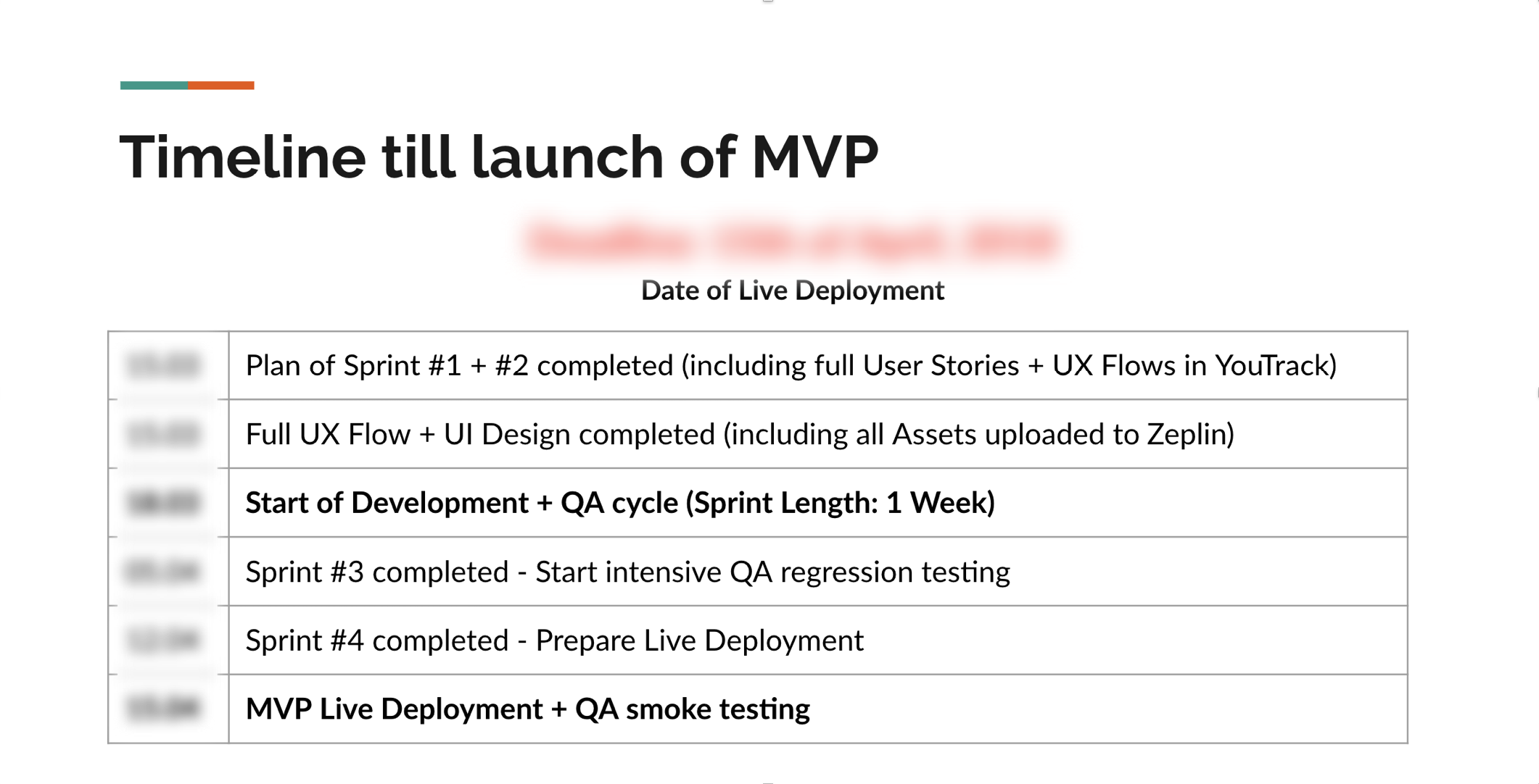
We aimed to launch an MVP of Tajawal’s new mobile site as a Progressive Web App, given the performance and UX benefits it provides for mobile web customers.
We kicked off the project by working closely with our Head of Product and VP of Product as the main two stakeholders.
We kicked off the project by working closely with our Head of Product and VP of Product as the main two stakeholders.
Team planning, MVP definition and timeline were discussed in our first two meetings along with a release plan and success metrics (CR & Lighthouse score increase)
We focused the MVP to be only about the Flight booking journey. Our data indicated this to be the most used product (over hotel booking) and we expected the biggest impact by focusing our efforts on this particular user journey.
We focused the MVP to be only about the Flight booking journey. Our data indicated this to be the most used product (over hotel booking) and we expected the biggest impact by focusing our efforts on this particular user journey.
Understanding data + research to kick off concepting
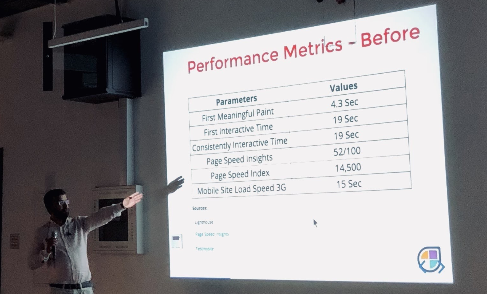
In order to define the scope of our MVP, I looked into the existing mobile website and made a problem analysis. Speed was one of the key success metrics for the new PWA as it’s tightly connected to bounce off rates. We used Google Lighthouse to evaluate our existing site and compare it with any changes we release in the future.
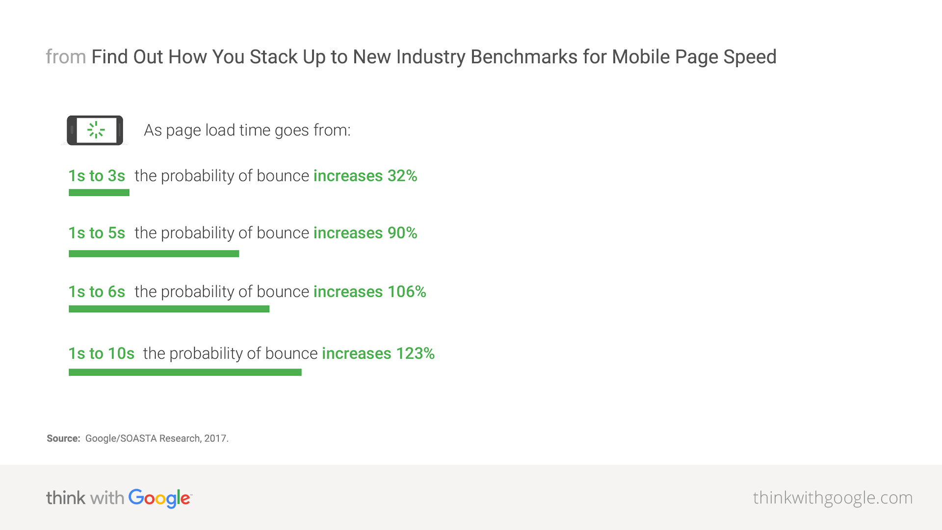

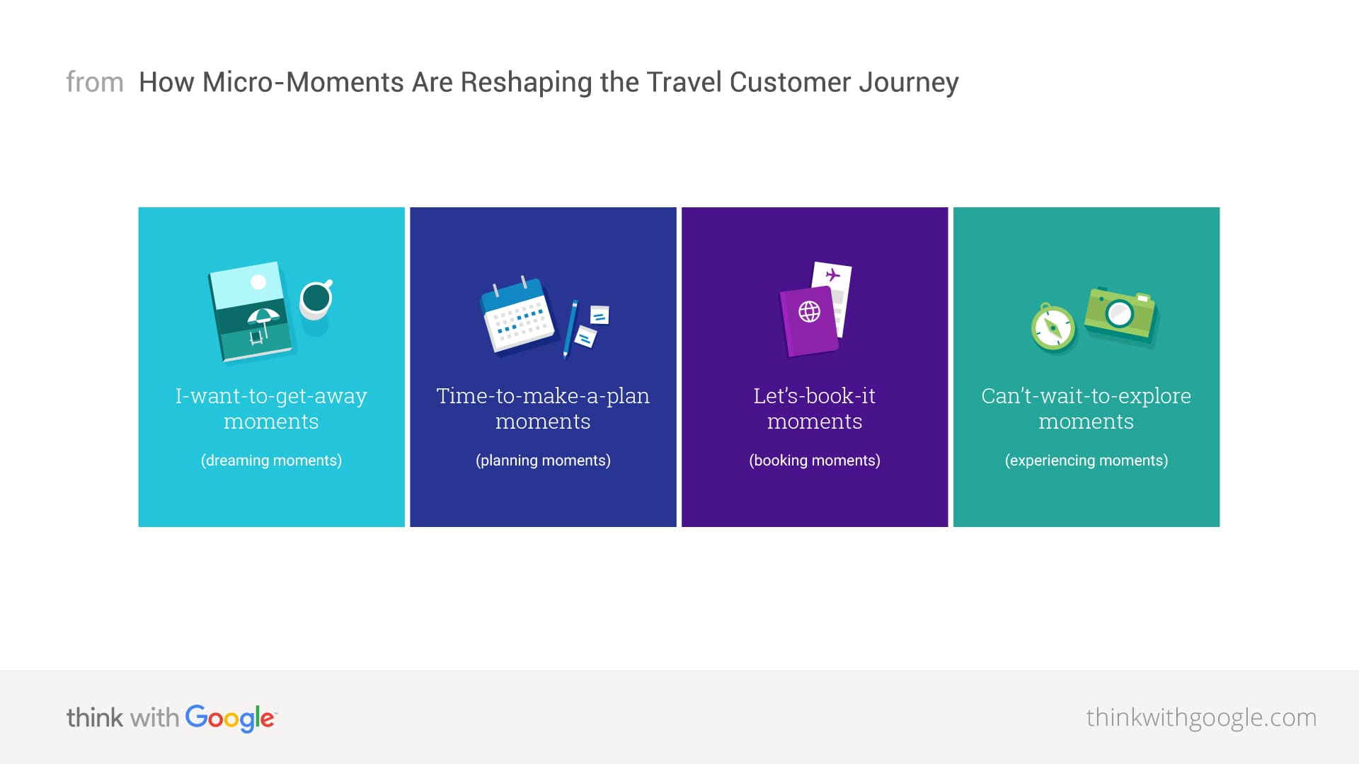
Besides our own data we looked into industry benchmarks (conversion rates, bounce off, mobile web performance in travel) and research done by experts. Google Insights as a secondary research source was signifact to understand travel personas better and shaped how I approached the user journey.
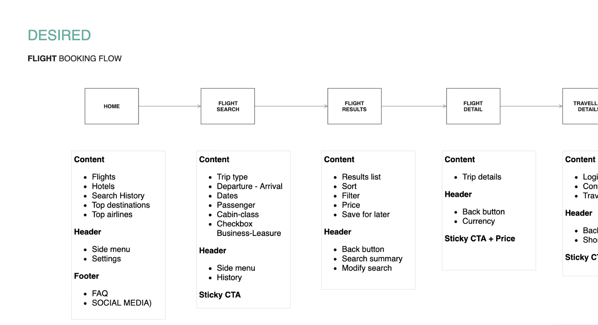
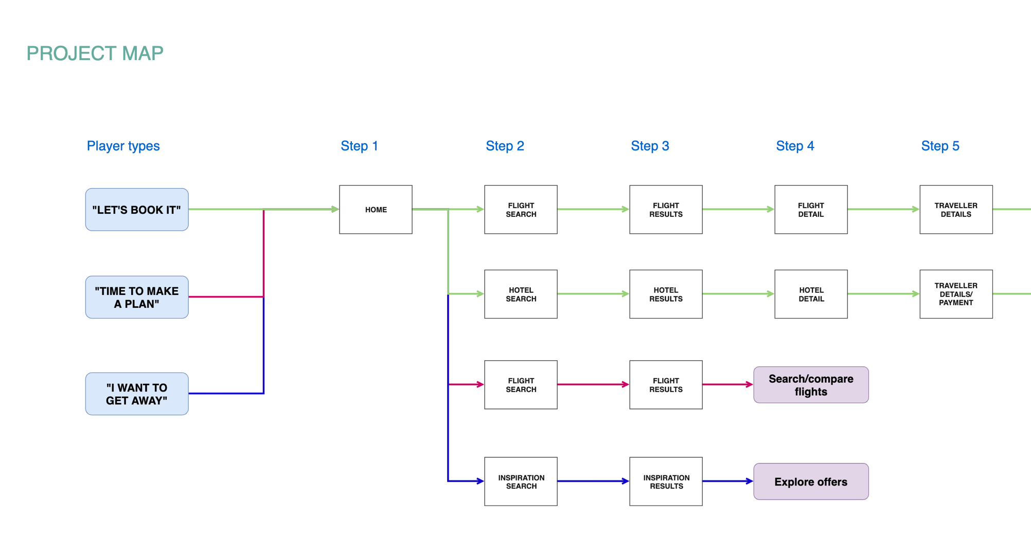
I translated all research into a user flow originating in the micro-moments that were relevant to our case. With different intends, users would flow differently through the mweb journey and expect varying content. A UX sitemap outlined the content in each step.
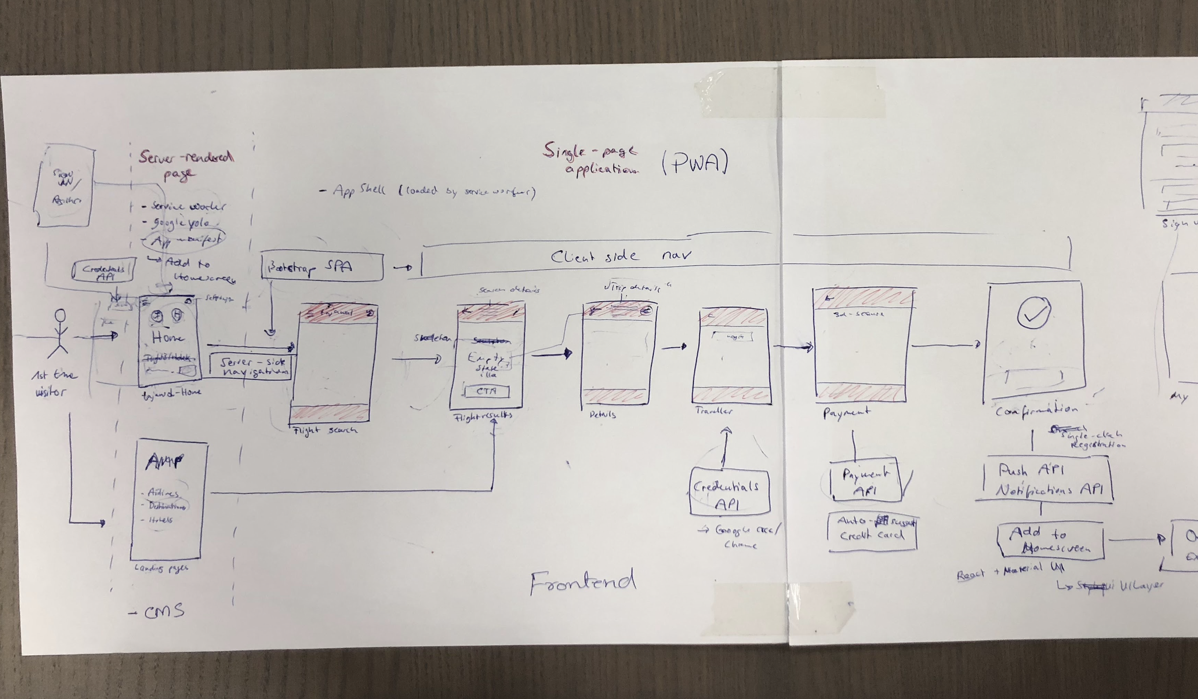
With both flow and map available I kicked off collaboration with our devs. We sketch out the
initial PWA infrastructure (”App shell”) and determined missing backend capabilities (e.g. APIs) to provide the user with contextual data and functionality at every step of their journey.
Our lead developer Khurrum wrote a detailed study on Medium which deep dives into the technical changes.
From low- to high-fidelity designs to launch
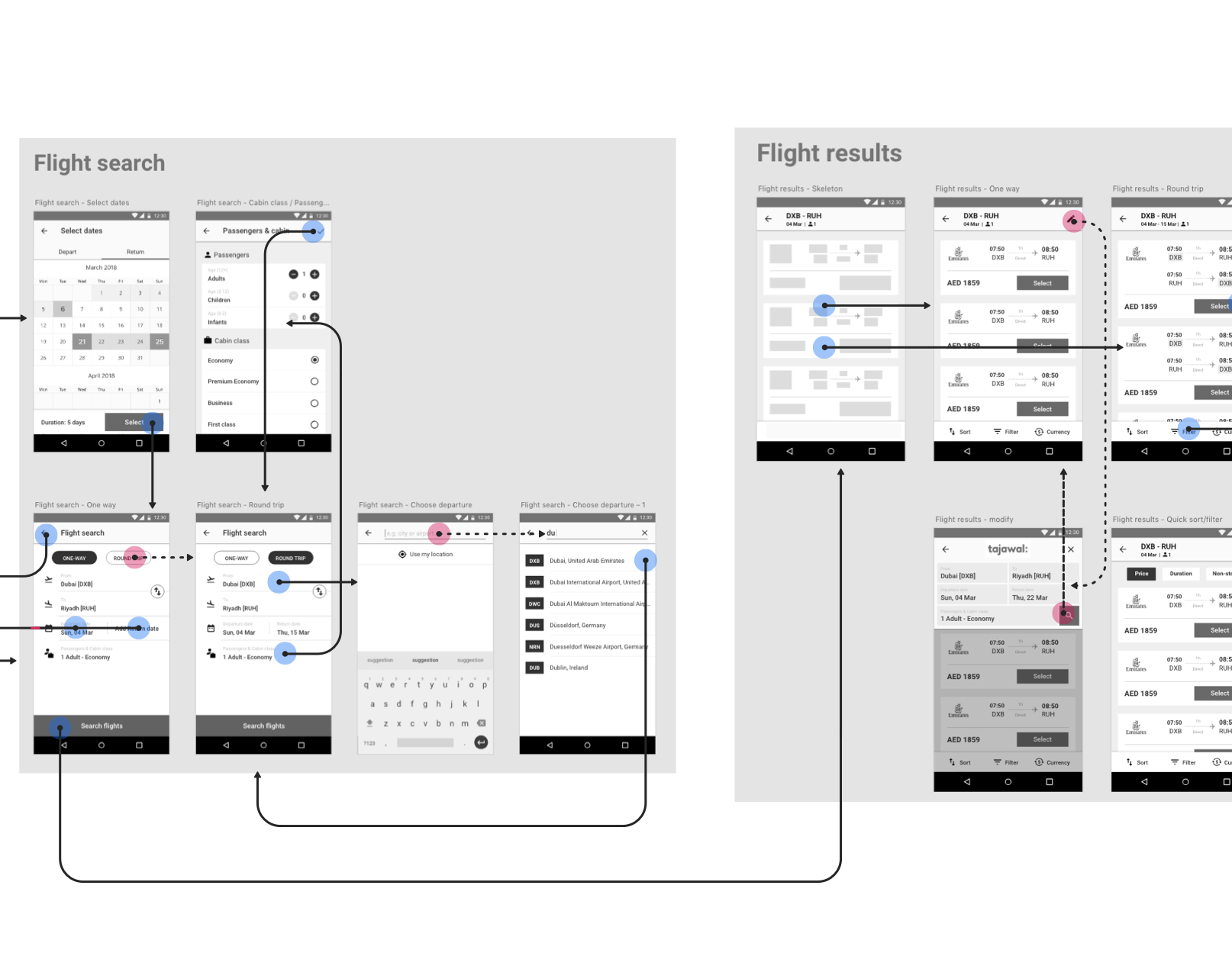
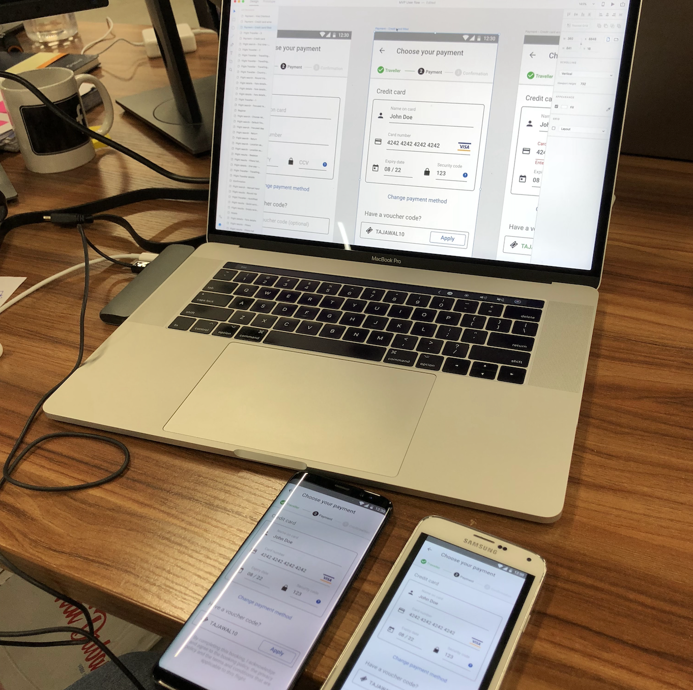
Aligned with our dev team, I created a wireflow to visualize the screens and steps a user needs to take to achieve certain goals such as flight search or flight booking. We also tested the high fidelity prototype on commonly used mobile devices in our target market to demonstrate the flow to our dev team and do some preliminary testing for blindspots.
UX decisions
Designing a PWA has to comply with performance requirements and mobile web specific conditions. To make sure the experience stays slick and gets the highest scores in Lighthouse, we used Google Web Fonts (with Tajawal’s own typeface) and Material UI, a React components library that implement Google Material Design.
In order to give users a convenient mobile experience we set the goal to have the look & feel of a native mobile app. We implemented a permanent Appbar for navigating and a sticky bottom bar/tabbar for the CTA, price summary and important tools (filter, sort, currency).
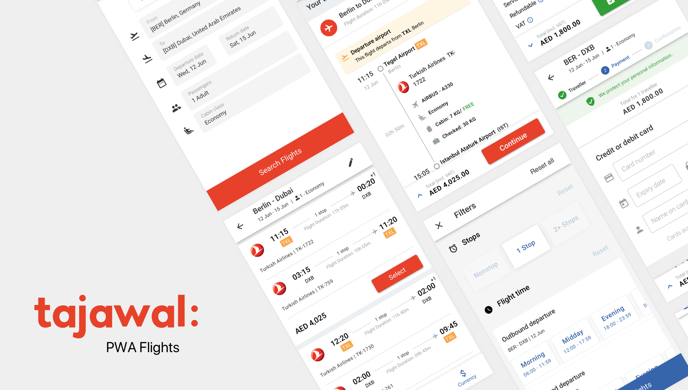
Shortly after the launch we extended the PWA to cover the hotel booking journey as well.

Outcome and learnings
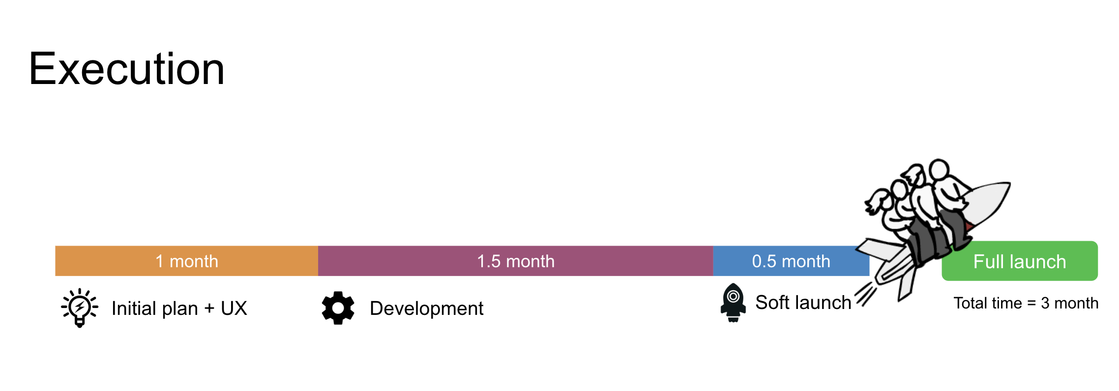
As initially planned, we launched the new PWA in record time and provided our users with a fast, convenient and familiar experience on mobile devices.
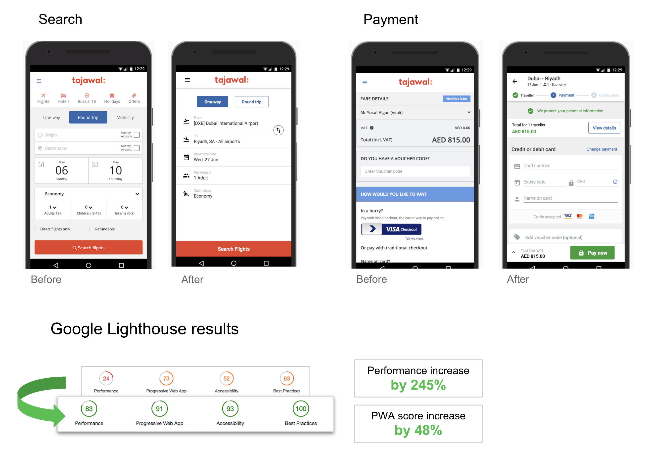
With the PWA, we saw an increase in our conversion rates by over 30%. The Lighthouse results, our performance indicator, showed incredible results as well. The Lighthouse score went from 64 to an avg. of 90!
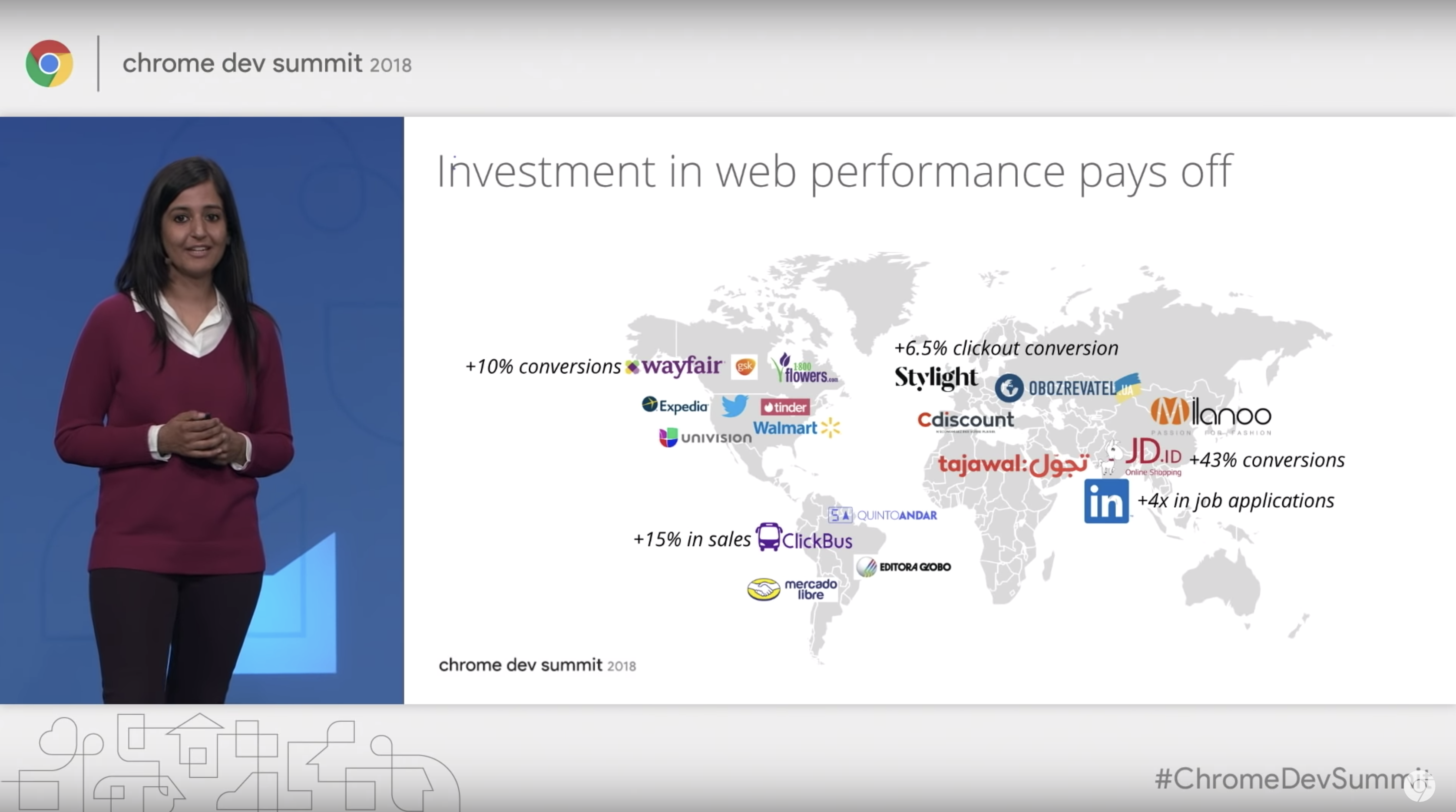
We were the first company to work with and being part of Google's mWeb Innovation Program in Dubai. Our success made it to the chrome dev summit 2018 next to big names like LinkedIn, wayfair, Expedia, Walmart etc.
Recap
When the opportunity presented itself to move to Dubai for this project, my initial thought was how much of a life experience that would be - and it was. I made new friends, enjoyed all what Dubai offered with my family and grew as a designer. Putting the product manager/owner hat on taught me even more that good UX is about compromises - the ones we make considering budget, people, time to market, tech and the level of polish. And what actually matters in the end is the product we launch to our users. Have we solved the problem and helped them achieve their goals in the best possible way?
When the opportunity presented itself to move to Dubai for this project, my initial thought was how much of a life experience that would be - and it was. I made new friends, enjoyed all what Dubai offered with my family and grew as a designer. Putting the product manager/owner hat on taught me even more that good UX is about compromises - the ones we make considering budget, people, time to market, tech and the level of polish. And what actually matters in the end is the product we launch to our users. Have we solved the problem and helped them achieve their goals in the best possible way?
You reached the end of this case study. I hope you enjoyed it as much as me writing it. If anything was unclear or you have questions I would appreciate your feedback!
Thank you!
